User interface
📚 Reminder
Compose Multiplatform
Compose Multiplatform simplifies and accelerates UI development for Desktop and Web applications, and allows extensive UI code sharing between Android, iOS, Desktop and Web. It's a modern toolkit for building native UI. Quickly bring your app to life with less code, powerful tools, and intuitive Kotlin APIs. It is based on Android Jetpack Compose declarative UI approach ( which is similar also to SwiftUI for iOS )
How to create composables ?
Composables are UI components that can be simply declared with code as functions, properties (such as text color, fonts...) as function parameters and subviews are declared on function declaration.
- An
@Composableannotation come always before the composable function. - Properties of size, behaviors of components can be set thanks to
Modifiers. It permit to decorate and augent composables - You can align components with containers composables such as
Column(Vertically),Box,Row(Horizontally) - Also you can preview composables with the annotation
@Previewbefore the composable annotation.
Example: 2 texts vertically aligned that fit all the width of the screen.
@Composable
fun App() {
    MaterialTheme {
        Column(Modifier.fillMaxWidth()) {
            Text( "My Text1", color = Color.Blue)
            Text(text = "My Text2")
        }
    }
}
Find composables available
For more information, you can have a look to Android Jetpack Compose documentation
Create composable for the Quiz
🧪 WelcomeScreen
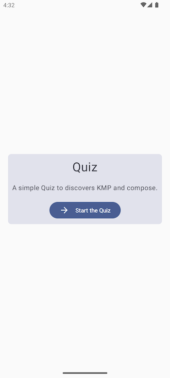
You can now create your first view. For the Quiz we need a welcome screen displaying a Card centered with a button inside to start the quiz It is simply compose of the following composables :
a Card rounded shape container
a Text
a Button
Create a new composable
WelcomeScreen.kton commonMain moduleMake sure that the App() composable is using it has below
@Composable
fun App() {
    MaterialTheme {
        welcomeScreen()
    }
}
- Run you first view on all platforms , it should work.
🧪 ScoreScreen
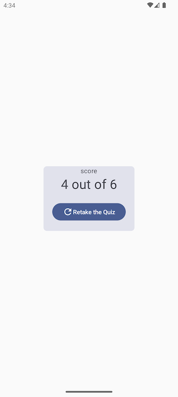
The second view will be quite similar but able de show final scores
- Create a new composable
ScoreScreen.kton commonMain module - Make sure that the App() composable is using it has below
- The composable will have a
Stringvalue as parameter
@Composable
fun App() {
    MaterialTheme {
        scoreScreen("10/20")
    }
}
- Run you first view on all platforms , it should work.
🧪 QuestionScreen
Data classes for Quiz modeling
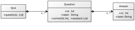
We can create classes on the package data.dataclasses
Answer.kt (commonMain)
data class Answer(val id: Int, val label: String )
Question.kt (commonMain)
data class Question(val id:Int, val label:String, val correctAnswerId:Int, val answers:List<Answer>)
Quiz.kt (commonMain)
data class Quiz(var questions: List<Question>)
Make the composable
Now we can make a composable with interactions.
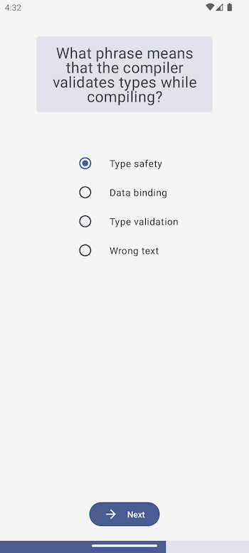
The screen is composed of :
- The question label in a
Card - Single choice answer component with
RadioButton - A
Buttonto submit the answer - A
LinearProgressIndicatorindicating the quiz progress
After creating the UI view, we can pass to this composable the list of questions. When the Appcomposable will create questionScreen() composable we will generate mock questions data for now to generate the list of questions.
State management
All views of question will be one unique composable that updates with the correct question/answers data each time we are clicking on the next button.
We use MutableState value for that. It permit to keep data value and recompose the view when the data is changed. It's exactly what we need for our quiz page :
- Keep the value of the question position on the list
- Keep the value of the answer selected by the user each time he switch between RadioButtons
- Keep the score to get the final one at the end of the list.
Here is an example of MutableState value declaration
    var questionProgress by remember { mutableStateOf(0) }
    ...
You can declare the 2 other MutableState values and after use it on your composable ensuring that on the button click questionProgressis incrementing so the question and his answers can change on the view.
🧪 Exercise
Create the composable screens WelcomeScreen.kt and ScoreScreen.kt and then the QuestionScreen.kt. Try to be accurate regarding the screenshots and the described features. provided.
Warning
For now, no navigation is implemented, so you can only display the screens one after another by changing the App() composable content.
🎯 Solutions
WelcomeScreen.kt (SourseSet : commonMain)
@Composable
fun WelcomeScreen(){

    Box(
        contentAlignment = Alignment.Center,
        modifier = Modifier.fillMaxWidth().fillMaxHeight()
    ) {
        Card(
            shape = RoundedCornerShape(8.dp),
            modifier = Modifier.padding(10.dp),
        ) {
            Column(horizontalAlignment = Alignment.CenterHorizontally) {


                Column(horizontalAlignment = Alignment.CenterHorizontally) {
                    Text(
                        text = "Quiz",
                        fontSize = 30.sp,
                        modifier = Modifier.padding(all = 10.dp)
                    )
                    Text(
                        modifier = Modifier.padding(all = 10.dp),
                        text = "A simple Quiz to discovers KMP and compose.",
                    )
                    Button(
                        modifier = Modifier.padding(all = 10.dp),
                        onClick = {  }

                    ) {
                        Text("Start the Quiz")
                    }
                }
            }
        }
    }
}
ScoreScreen.kt (SourseSet : commonMain)
@Composable
fun ScoreScreen(score: String){
    Box(
        contentAlignment = Alignment.Center,
        modifier = Modifier.fillMaxWidth().fillMaxHeight()
    ) {
        Card(
            shape = RoundedCornerShape(8.dp),
            modifier = Modifier.padding(10.dp),
            colors = androidx.compose.material3.CardDefaults.cardColors(
                containerColor = Color.Green
            )
        ) {
            Column(horizontalAlignment = Alignment.CenterHorizontally) {
                Column(horizontalAlignment = Alignment.CenterHorizontally) {
                    Text(
                        fontSize = 15.sp,
                        text = "score",
                    )
                    Text(
                        fontSize = 30.sp,
                        text = score,
                    )
                    Button(
                        modifier = Modifier.padding(all = 20.dp),
                        onClick = {
                        }
                    ) {
                        Text(text = "Retake the great Quiz")
                    }
                }
            }
        }
    }
}


@Preview
@Composable
fun ScoreScreenAndroidPreview(){
    ScoreScreen("10/10")
}
To use default icons please add the following dependency to your build.gradle.kts commonMain sourceSet
commonMain.dependencies {
        implementation(compose.materialIconsExtended)
}
package screens contains all the composables for the Quiz app.
QuestionScreen.kt (SourceSet : commonMain)
@Composable
fun QuestionScreen(questions: List<Question>) {

    var questionProgress by remember { mutableStateOf(0) }
    var selectedAnswer by remember { mutableStateOf(1) }
    var score by remember { mutableStateOf(0) }

    Column(
        modifier = Modifier.fillMaxWidth().fillMaxHeight(),
        verticalArrangement = Arrangement.Center,
        horizontalAlignment = Alignment.CenterHorizontally
    ) {
        Card(
            shape = RoundedCornerShape(5.dp),
            modifier = Modifier.padding(60.dp)
        ) {
            Column(
                horizontalAlignment = Alignment.CenterHorizontally,
                modifier = Modifier.padding(horizontal = 10.dp)
            ) {
                Text(
                    modifier = Modifier.padding(all = 10.dp),
                    text = questions[questionProgress].label,
                    fontSize = 25.sp,
                    textAlign = TextAlign.Center
                )
            }
        }
        Column(modifier = Modifier.selectableGroup()) {
            questions[questionProgress].answers.forEach { answer ->
                Row(
                    modifier = Modifier.padding(horizontal = 16.dp),
                    verticalAlignment = Alignment.CenterVertically
                ) {
                    RadioButton(
                        modifier = Modifier.padding(end = 16.dp),
                        selected = (selectedAnswer == answer.id),
                        onClick = { selectedAnswer = answer.id },
                    )
                    Text(text = answer.label)
                }
            }
        }
        Column(modifier = Modifier.fillMaxHeight(), horizontalAlignment = Alignment.CenterHorizontally, verticalArrangement = Arrangement.Bottom) {
            Button(
                modifier = Modifier.padding(bottom = 20.dp),
                onClick = {
                    if(selectedAnswer == questions[questionProgress].correctAnswerId) {
                        score++
                    }
                    if (questionProgress < questions.size - 1) {
                        questionProgress++
                        selectedAnswer = 1
                    }else{
                        // Go to the score section
                    }
                }
            ) {
                if(questionProgress < questions.size - 1) NextOrDoneButton(Icons.AutoMirrored.Filled.ArrowForward,"Next")
                else NextOrDoneButton(Icons.Filled.Done,"Done")
            }
           LinearProgressIndicator(
            progress = { questionProgress.div(questions.size.toFloat()).plus(1.div(questions.size.toFloat())) },
            modifier = Modifier.fillMaxWidth().height(20.dp),
            color = ProgressIndicatorDefaults.linearColor,
            trackColor = ProgressIndicatorDefaults.linearTrackColor,
            strokeCap = ProgressIndicatorDefaults.LinearStrokeCap,
            )
        }
    }
}

@Composable
fun NextOrDoneButton(iv: ImageVector, label:String){
    Icon(
        iv,
        contentDescription = "Localized description",
        Modifier.padding(end = 15.dp)
    )
    Text(label)
}
App.kt (SourceSet : commonMain)
@Composable
fun App() {
    MaterialTheme {
        val questions = listOf(
            Question(
                1,
                "Android is a great platform ?",
                1,
                listOf(Answer(1, "YES"), Answer(2, "NO"))
            ),
            Question(
                1,
                "Android is a bad platform ?",
                2,
                listOf(Answer(1, "YES"), Answer(2, "NO"))
            )
        )
        QuestionScreen(questions)
    }
}
Your Quiz have now all his composable screens made. Let's connect it to the Internet
✅ If everything is fine, go to the next chapter →
Sources
The full solution for this section is availabe here